
We built our school bond measure support score to predict how California voters would respond before a single ballot went out. We wanted to see how well it actually held up against real results, so here’s our analysis of how it performed in the June 2026 election.
One measure was set aside before any number in this piece was calculated: a nearly billion-dollar community college bond in Contra Costa County that, on its own, drew more votes than every other bond measure in this analysis combined. It’s a genuine outlier, not a typical district race, and leaving it in would mean one district’s result speaking for the whole state. Every figure below reflects the remaining 25 bond measures, which look like a normal cross-section of California districts.
What Is the School Bond Measure Support Score?
Every California school district gets a bond score from EMC. The score models each registered voter’s likelihood to support a generic school bond measure, then rolls those individual estimates up into a district-level projection. It’s deliberately generic: built before a specific measure exists, so it has no idea what the bond will pay for, how the ballot argument will read, or who ends up running the campaign.
June 2026 School Bond Measures · 25 Documented Races Matched to EMC Scores
How the Bond Score Held Up in June 2026
Here’s how we put the score to the test: we took every fully documented school bond measure on the June 2026 ballot and matched it to EMC’s district-level score. All 25 measures in this analysis have a confirmed final vote share, and 22 have raw vote counts detailed enough to weight the comparison by turnout.
School bonds have had a rocky few years to climb out of. Statewide passage bottomed out at 50.5% in 2020, climbed to 71.1% in 2022, and reached 75.6% in 2024. June 2026 cooled off from that peak: 62% of bond measures passed statewide, still above the 2020 low but behind both of the two most recent cycles.
| Year | Bond Measures | Passed | Failed | Passage Rate |
|---|---|---|---|---|
| 2020 | 182 | 92 | 90 | 50.5% |
| 2022 | 121 | 86 | 35 | 71.1% |
| 2024 | 307 | 232 | 75 | 75.6% |
| 2026 (June) | 26 | 16 | 10 | 62% |
Part of that softer cycle is worth reading against who actually showed up. Democratic candidates in the Assembly, Senate, and congressional races on the same June ballot took roughly 62% of the two-party vote in districts where a Democrat ran, a comfortably Democratic electorate by recent standards. Bond support tends to move with that lean, so a cooler bond cycle alongside a favorable electorate is a reminder that turnout composition is only part of the story.
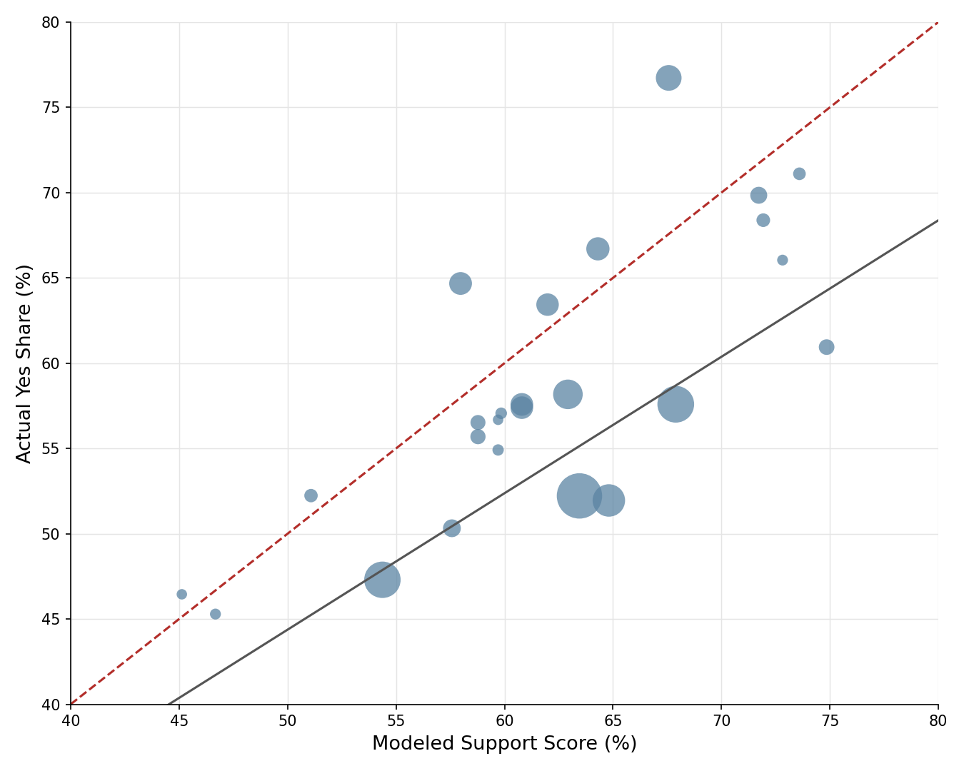
The chart above shows a fairly consistent pattern when comparing the projected vote share and the actual vote share, though the unweighted trend line sits below the dashed line marking a perfectly calibrated score across most of the range. Most individual measures land within about 5 points of their score in either direction, with a few larger misses pulling the average down.
When comparing raw vote counts to projected vote counts, about 94,400 voters cast a yes vote to approve their local school bond measure. Rescaling each district’s modeled support to its actual turnout, the score projected about 103,800 yes votes, running roughly 10% ahead of what voters actually delivered.
A Closer Look at Where the Score Landed
Zoom in on the topline number, and the fit looks reasonably solid. Weighted across each school district, actual results averaged 57.1% yes, running 5.6 points below the 62.7% the score projected statewide.
On the only number that matters on election night, whether a measure clears 55%, the score’s pass or fail call agreed with the outcome 84% of the time: 17 correct passes and 4 correct fails. It flagged 4 measures as likely to clear 55% that ultimately came up short, and it didn’t miss in the other direction. Not one measure it expected to fail actually passed.

Measure by measure, most districts still cluster within about 5 points of their score on either side, and a few, mostly in the Los Angeles area and the north state, cleared it comfortably. A handful of measures undershot by double digits, and those larger misses are doing most of the work in pulling the overall average down.
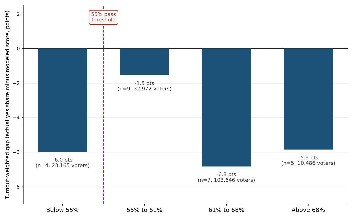
All eight Bay Area bond measures in this analysis ran colder than their score, a turnout-weighted average of 7.7 points below expectations, the coldest miss of any region this cycle. Los Angeles County came in closer, off by 3.3 points, and the rest of the state landed closest of all, missing by just 1.3 points on average. Whatever pushed this cycle below the model, it hit the Bay Area hardest.
How This Cycle Stacks Up Against 2024
June 2026 is a small sample by design, just one ballot’s worth of bond measures. The bigger test came in November 2024, when the same district-level score was checked against 205 school bond and parcel tax measures across the state, with modeled support rescaled to each district’s actual turnout. Modeled and actual yes votes tracked each other closely, a correlation of 0.995, and the typical district landed within about 4,300 yes votes of its projection, a small figure next to races that often drew tens or hundreds of thousands of voters.
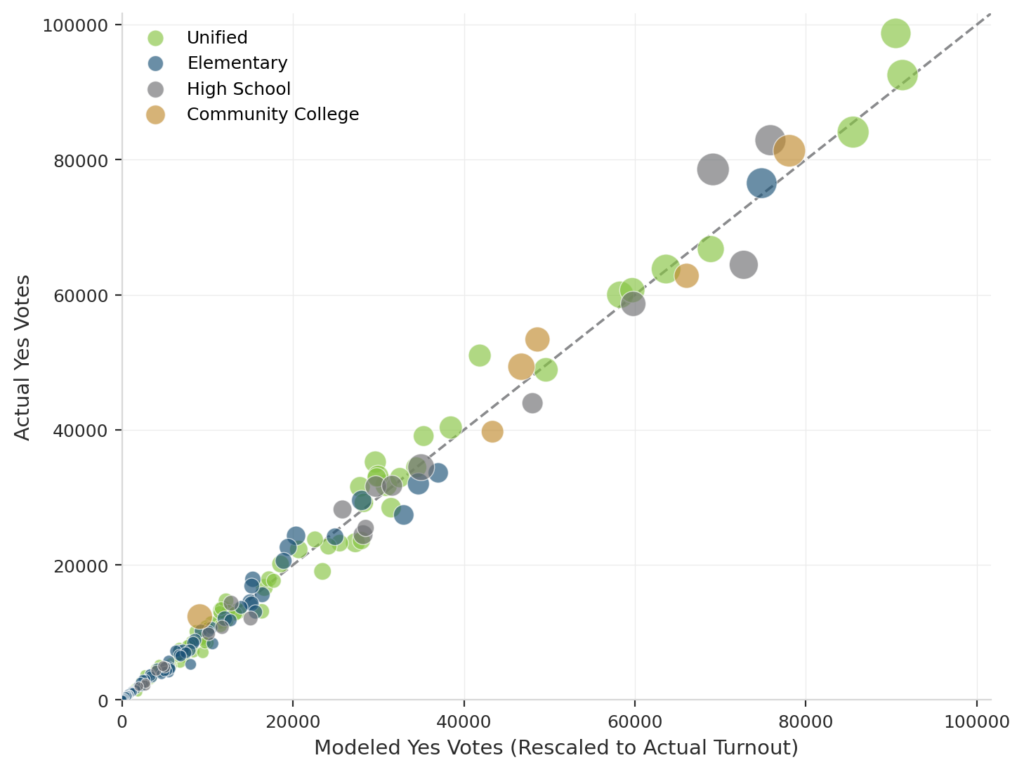
That track record is why a 5.6 point gap in June 2026 reads as a genuine shift rather than noise in the model. The score has held up well across a much larger set of races, so a June ballot running consistently a bit cooler than projected is a real signal about this cycle’s electorate, not a flaw in the approach itself.
No score can account for everything voters are weighing when they fill out a ballot. Economic anxiety, national politics, the mood of a particular news cycle, none of that is baked into a district-level model. Its value is as a stable baseline: a read on where a district would likely land under normal conditions, so a campaign can see how far this cycle’s environment is pushing voters away from it, and in which direction. That’s when a tool like this matters most. In a calm cycle, districts land close to their score. In an unsettled one, the gap between score and result is a signal that outside factors are having an impact.
Finding the Right Voters to Talk To
Underneath every district-level number in this analysis is a score for each individual registered voter, and that’s where a campaign gets its real value: knowing which of its own voters are worth a mail piece, a door knock, or a reminder to vote. Use the score to find those persuadable voters, not to bank on an exact result. Even when the district-level number misses, as it did in several districts this cycle, the individual voter scores underneath it still point a campaign toward the right people to target.
A note on method: This compares district level scores with district level results, not precinct or individual level data. This analysis covers 25 documented bond measures matched to an EMC district score; 22 of those have fully sourced raw vote counts and are weighted by actual votes cast, while the rest are weighted by modeled electorate size. The 55% pass or fail threshold is applied on its own, without adjusting for campaign spending, ballot language, or opposition.